Archive: Design creativity on Twitter: The Guardian
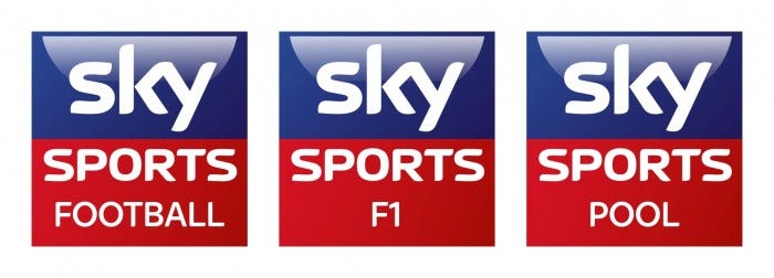
It's now common place for news and media organisations to create multiple accounts for the different elements of their business. For instance you can follow Sky Sports across numerous accounts, depending on your interest.
The obvious ones like Football, F1 and Cricket are all there, but so are the sports with smaller followings such as Sailing and Hockey, as well as the combined Snooker and Pool (which in itself appears a little confusing as it uses Snooker in the title but Pool in the logo and username).
However there is very little difference in the logos they're using; effectively they simply change the word below 'Sports' to the relevant sport. There are some exceptions but these are all specific programmes, where their own branding needs to link to what the viewer sees on-screen.
Now I should caveat this post by saying I have no problem with Sky's approach to these logos. In the instant timeline-refresh-world of Twitter, familiar branding stands out more than something overly quirky or different. It's telling that the majority of Sky's accounts steer away from sporting images, preferring to stick to the blue-red branding, therefore indicating immediately to the user who the tweet belongs to.
However, you can retain consistency but still offer smart, creative ideas and one brand does this brilliantly – The Guardian.
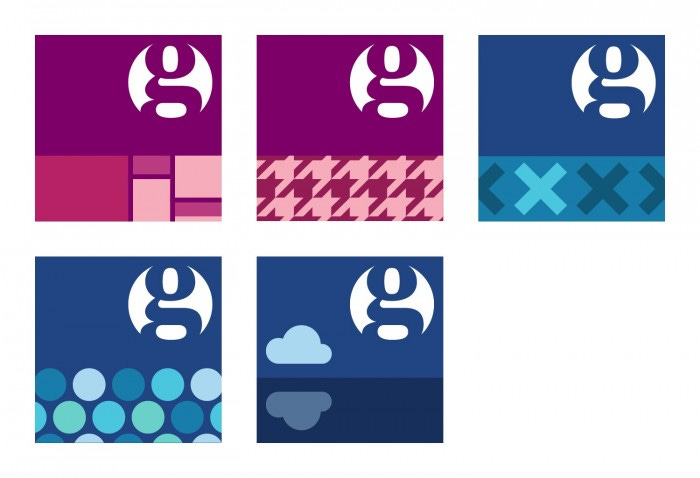
These accounts use an approximate two-thirds, one-third split to display the Guardian 'g' in the top section and relevant and simple icons to represent the account's topic in the lower section. Some real thought has been given to these icons, ensuring they don't encroach on the recognisable 'g' whilst being large enough to appear distinctive to the user.
Some of my favourites include the Art and Design account's nod to Mondrian, the Houndstooth pattern for Fashion, the voting Xs for Politics and the subtle brilliance of Society Guardian. Their Environment account cleverly plays on the two-thirds, on-third split, using the bottom half to reflect the cloud in water. Each one makes it easy to identify the particular topic, but also maintains recognition for the Guardian.
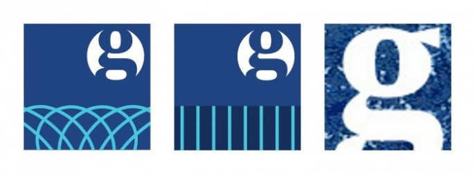
Some of the designs are even more abstract. Both Money and Business eschew more obvious routes. Having canvassed some opinions it seems they're potentially meant to represent the filigree designs seen on bank notes and a pinstripe suit respectively.
Guardian Belief is a curious one. It's a slightly blurry g and considering their efforts with other accounts this is unlikely to be a mistake. Perhaps it's meant to hint at something beyond humanity?
What do you think?
Visit the following links for the full list of Guardian and Sky Sports Twitter accounts:
Sky Sports
The Guardian


