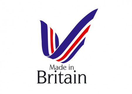
Archive: Made in Britain fails to hit the marque
A new marque was recently launched with the aim to boost sales of goods and services of British origin. This is obviously a great sentiment but the chosen design really doesn’t inspire me.
Clearly the design reflects a medal, yet the two font sizes don’t seem to link up with each other and the ribbon design. I also suspect the chosen red and blue aren’t correct in terms of the Union Jack – it will be interesting to see if that changes.
Personally, I feel an elegant interpretation of the Union Jack would have been perfectly suitable. Something similar to the design featured on the London Olympics website, see below:
If implemented correctly, the marque can be a success irrespective of design, however it may be a design many suppliers are not fond to include on their promotional material.


